Cornell Journal of Architecture website
Along with our work rebranding the CornellJournalofArchitecture, we also reimagined the Journal’s website, expanding its functionality so the site can serve as a repository for all issues of the publication, which date back as far as the 1980s.
On the site’s Issue page, each installment of the Journal is represented by a single image that appears in a kaleidoscopic animation when a user hovers over an issue link.
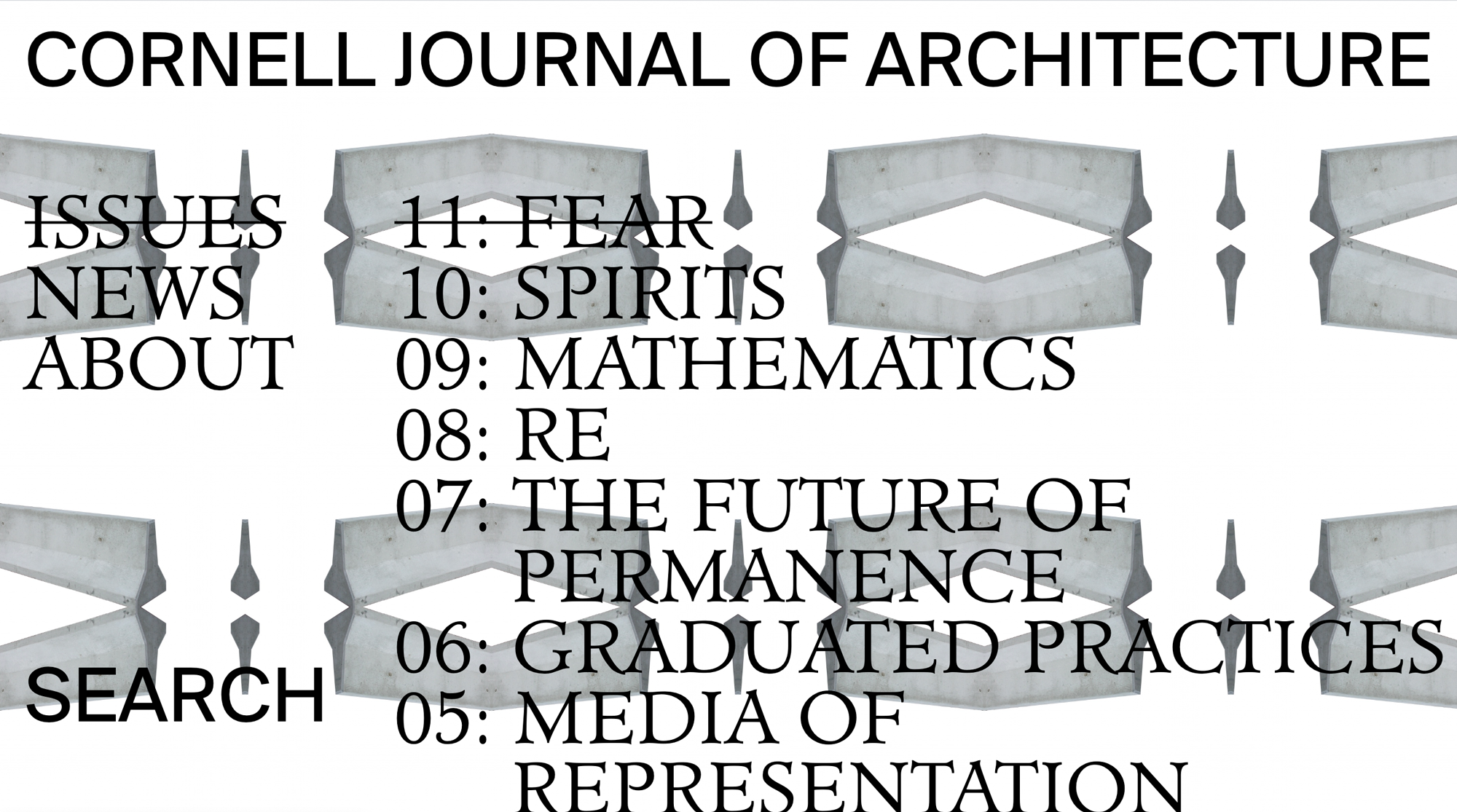
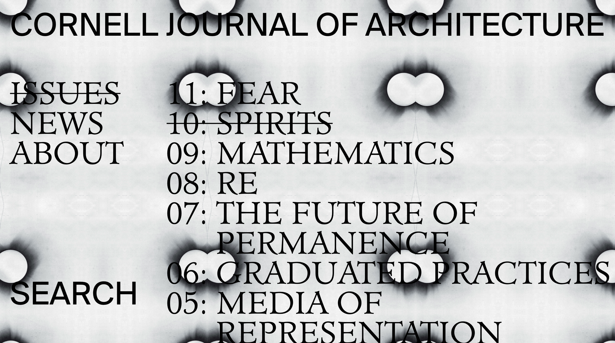
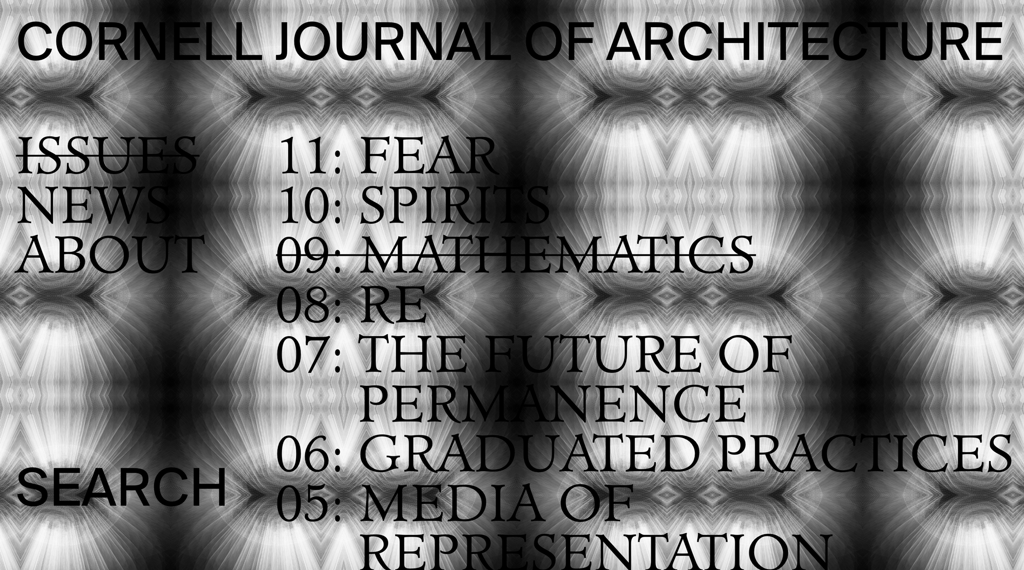
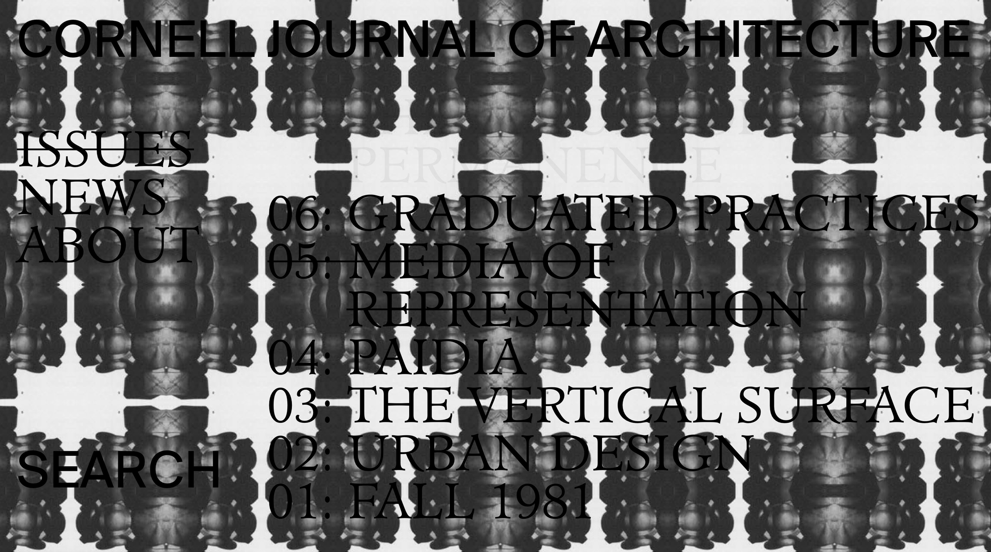
When an issue is selected, the animation becomes a static background layered below the issue’s content. An otherwise minimal site design prioritizes comfortable reading and browsing, much like the newly redesigned print magazine.
Each page of the site layers over the next, creating a sense of depth as the user explores.
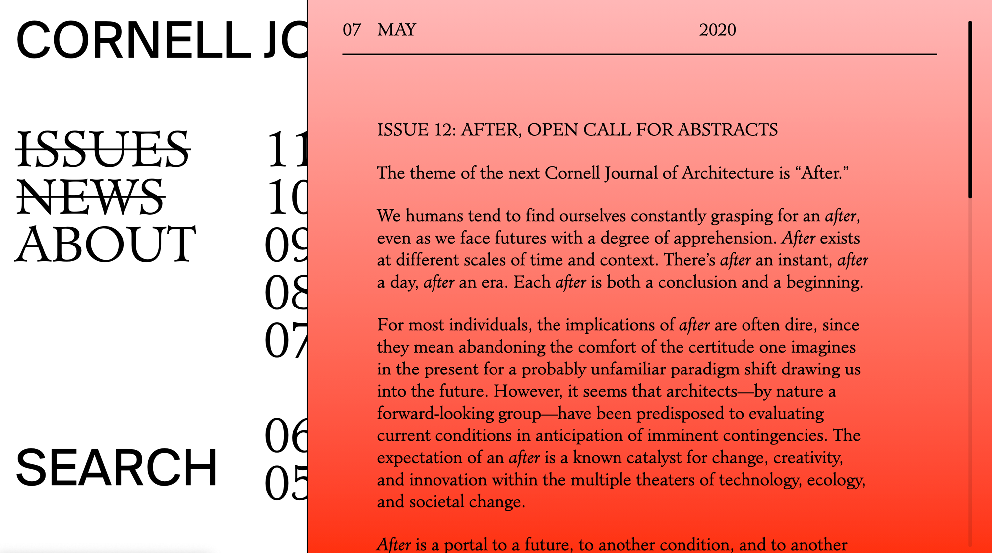
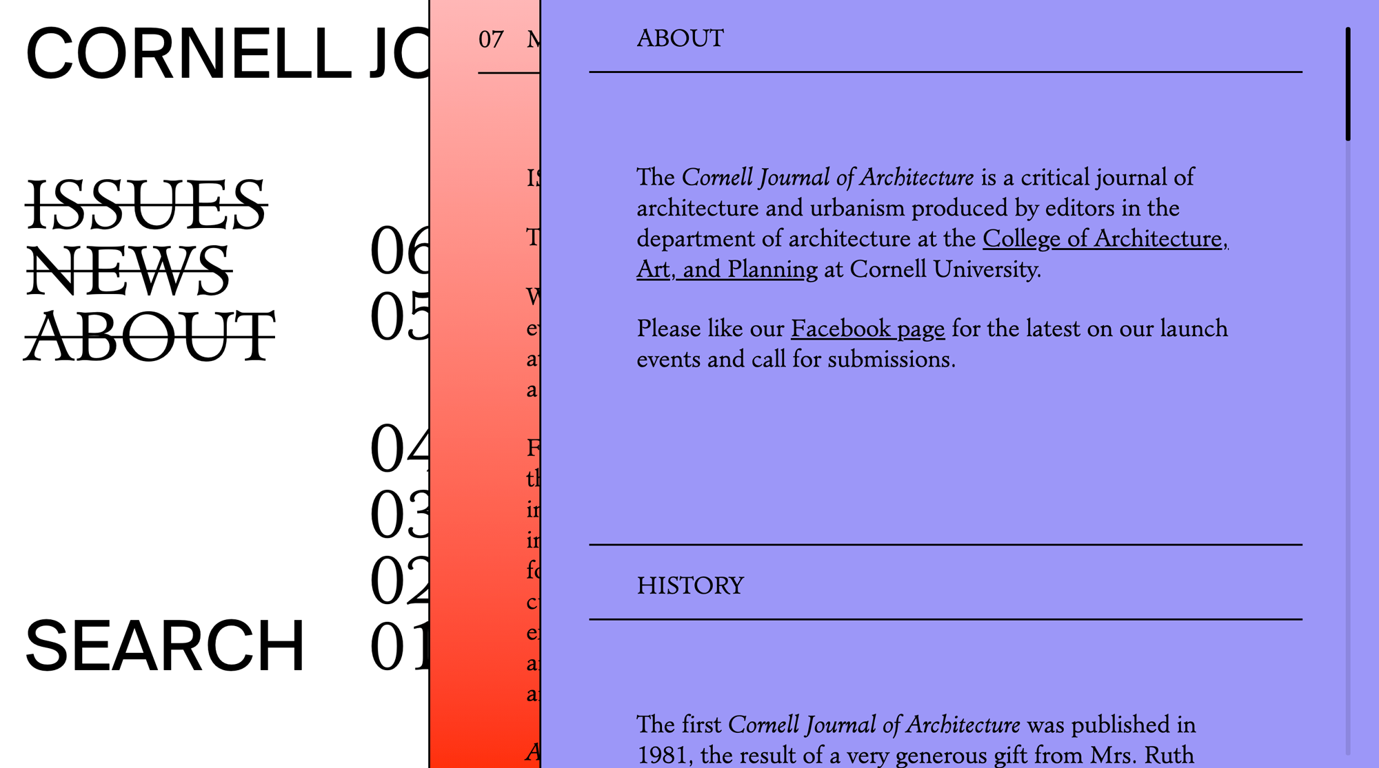
The entire site is searchable, allowing users to explore over 40 years of content.
Creative development: Maria Adelaide
Junior designers: Élise Rigollet, Juan Aranda
