AdHoc identity and website

We were engaged to rebrand AdHoc, the iconic Brooklyn-based concert promoter and publication, to coincide with the launch of AdHoc Projects, their new creative arm.
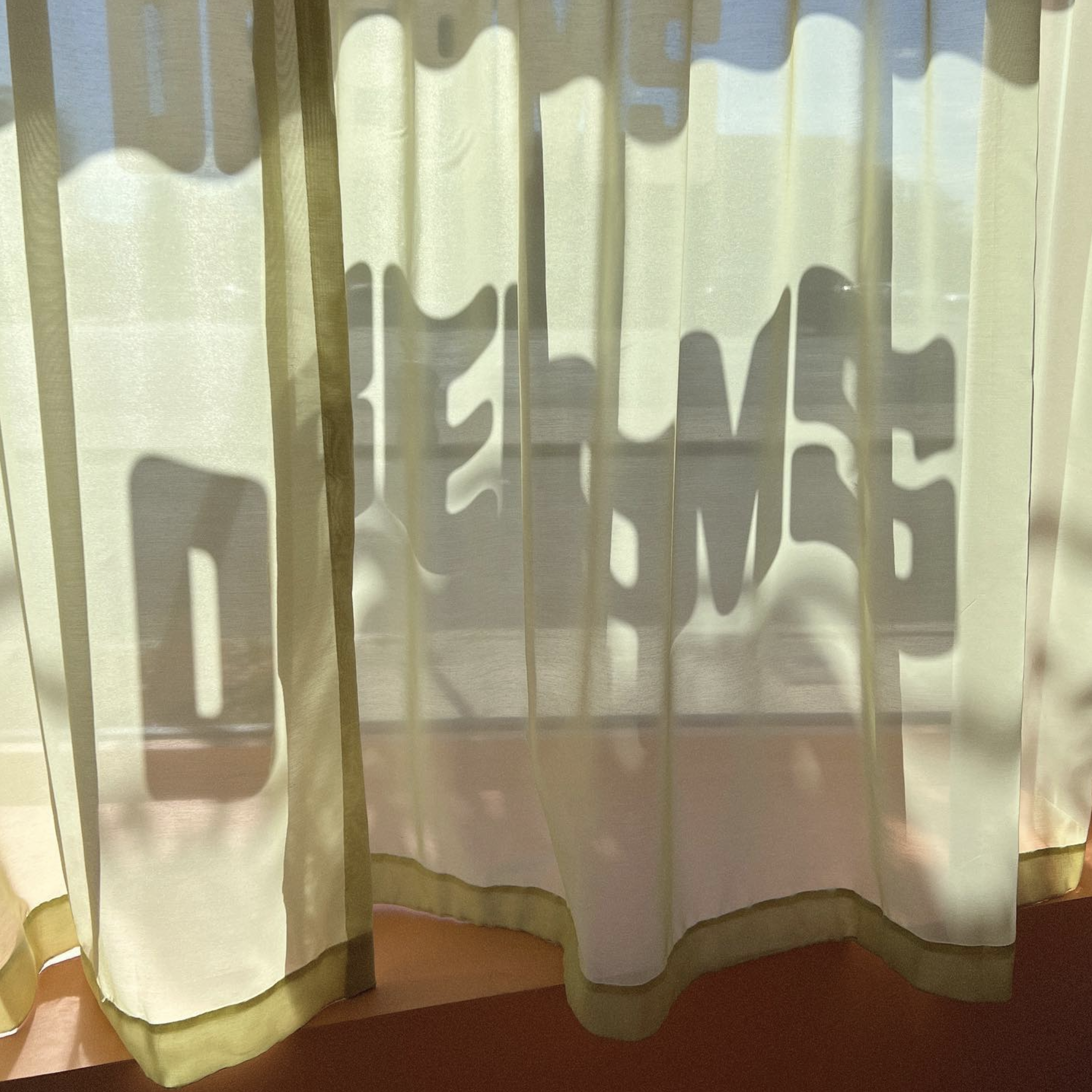
Tasked with developing an identity that would capture AdHoc’s irreverent, improvisational ethos, we created a flexible, kinetic mark that readily lends itself to animation—as on the AdHoc landing page.


The logo is a customization of the Pimpit typeface by BenoîtBodhuin, which we adapted in collaboration with Polytype, who also worked with us to create smushed and condensed versions of the mark as well as a simple monogram.
Putting this design system into action, we created an exuberant website for AdHoc Projects that highlights the brand’s creative services while showcasing AdHoc Presents’ transformative role in the New York music scene since its start in 2011.

Built with modularity in mind, image, video, and text blocks of various sizes can be easily added and rearranged—particularly within the site’s project pages—to accommodate different media and project types, and to ensure flexibility as the organization evolves.


The site is packed with unique details and interactions including text tickers, a custom video player, unique winding photo captions, and a suite of otherworldly creatures illustrated by KylePlatts.


Custom lettering: Polytype
Illustration: Kyle Platts
Web development: Maria Adelaide
Logo animation: Marinus Klinksik


